After exploring several creative territories, we landed on “From Potential to Proof”, a line about exactly what Workera verifies.
Once approved, it became more than a tagline. It became the foundation the whole visual identity was built on.

Workera was positioning itself as the gold standard in verified skills intelligence, but the brand hadn’t caught up. I led the work that gave it one big idea, and the system to prove it.
Its guidelines lived in a static PDF, there was no unifying visual idea tying the system together, and existing assets had been built before the company’s latest messaging was even defined.
After exploring several creative territories, we landed on “From Potential to Proof”, a line about exactly what Workera verifies.
Once approved, it became more than a tagline. It became the foundation the whole visual identity was built on.
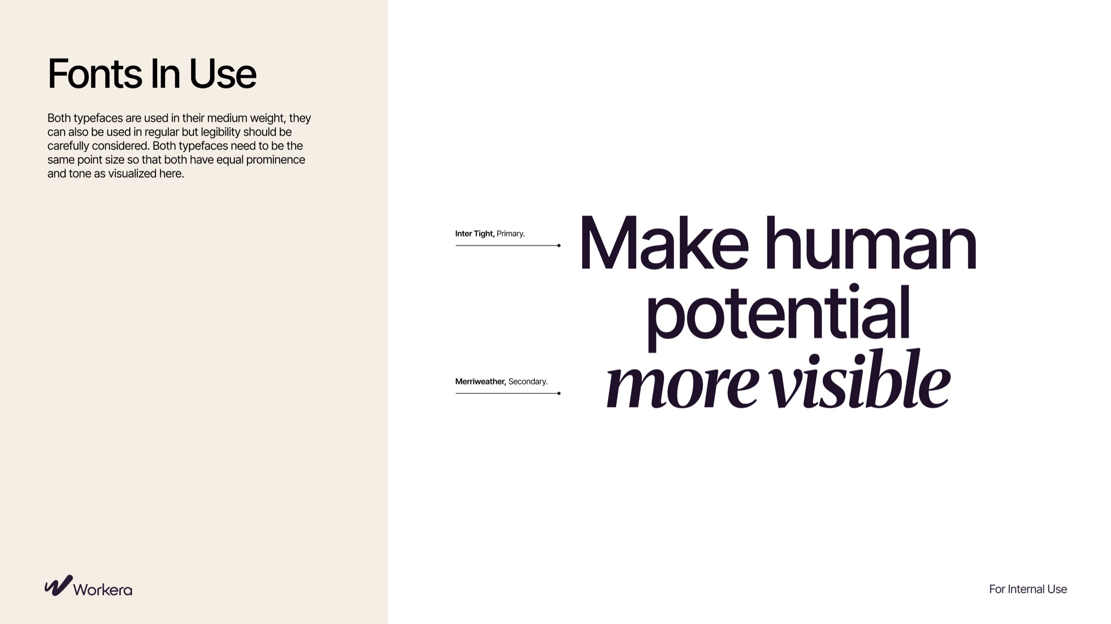
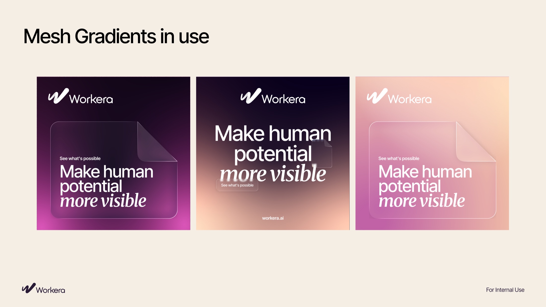
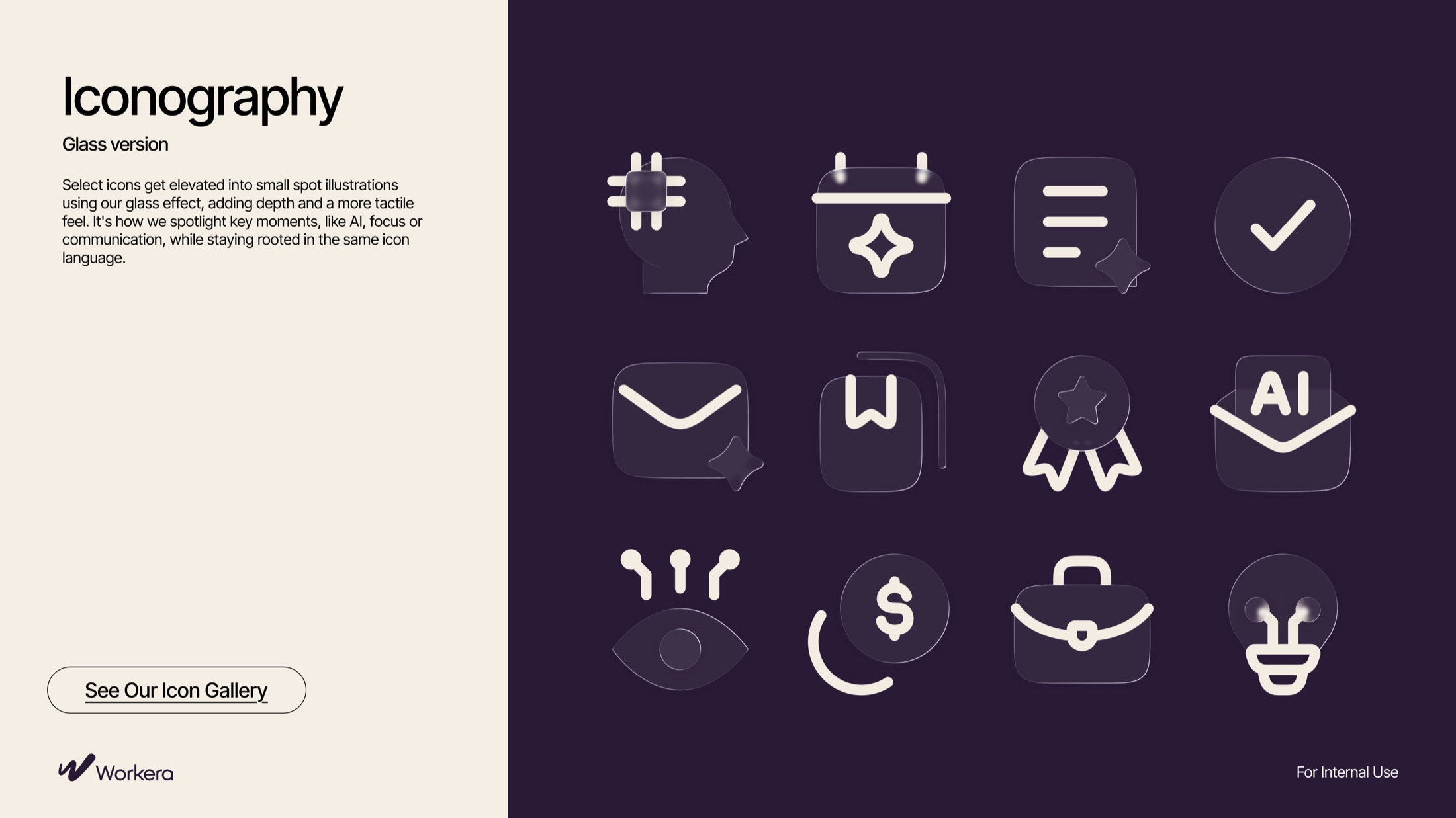
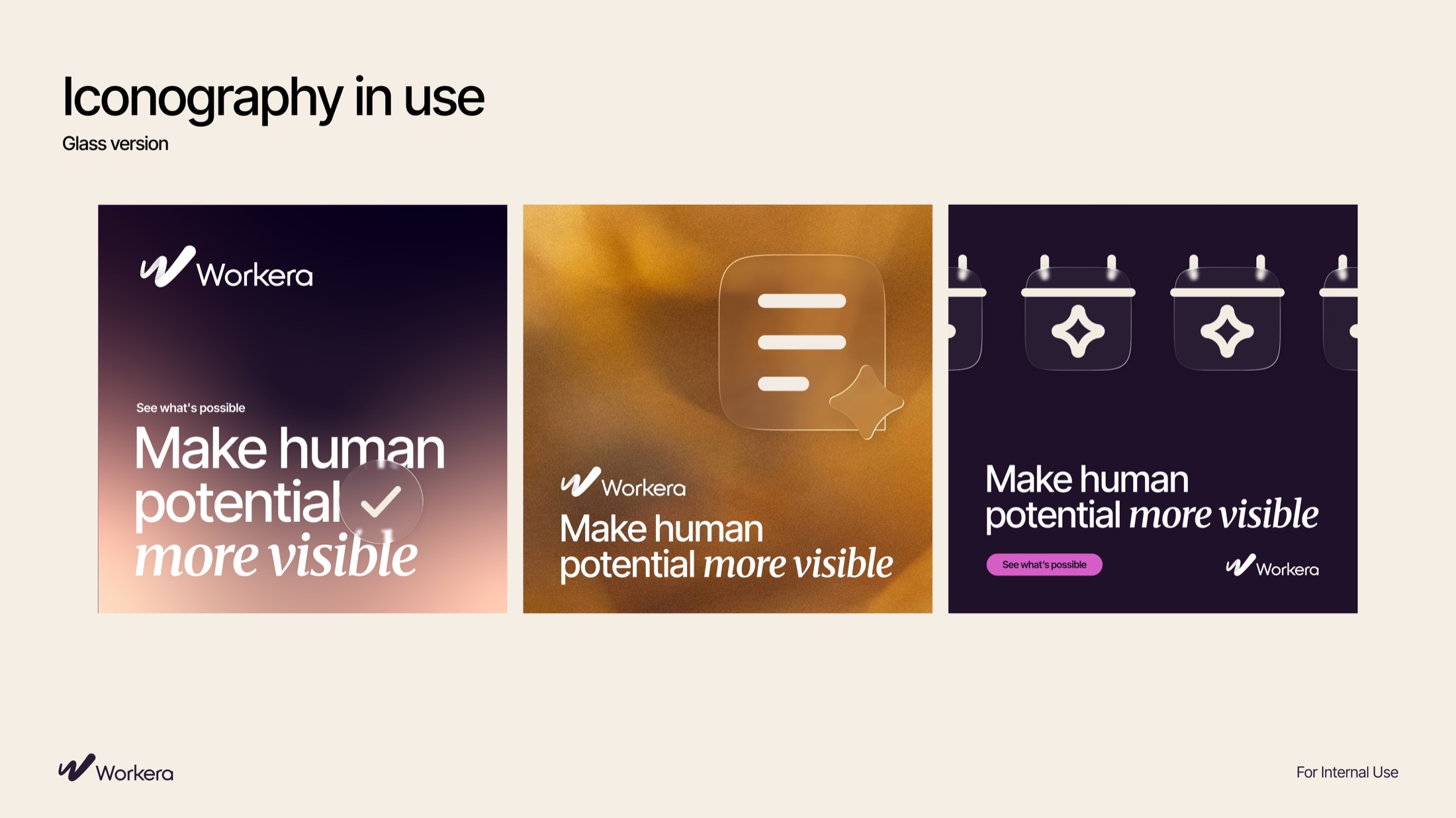
Glassmorphism, with translucent, layered glass elements, lets the core idea read at a glance: seeing people exactly as they are.
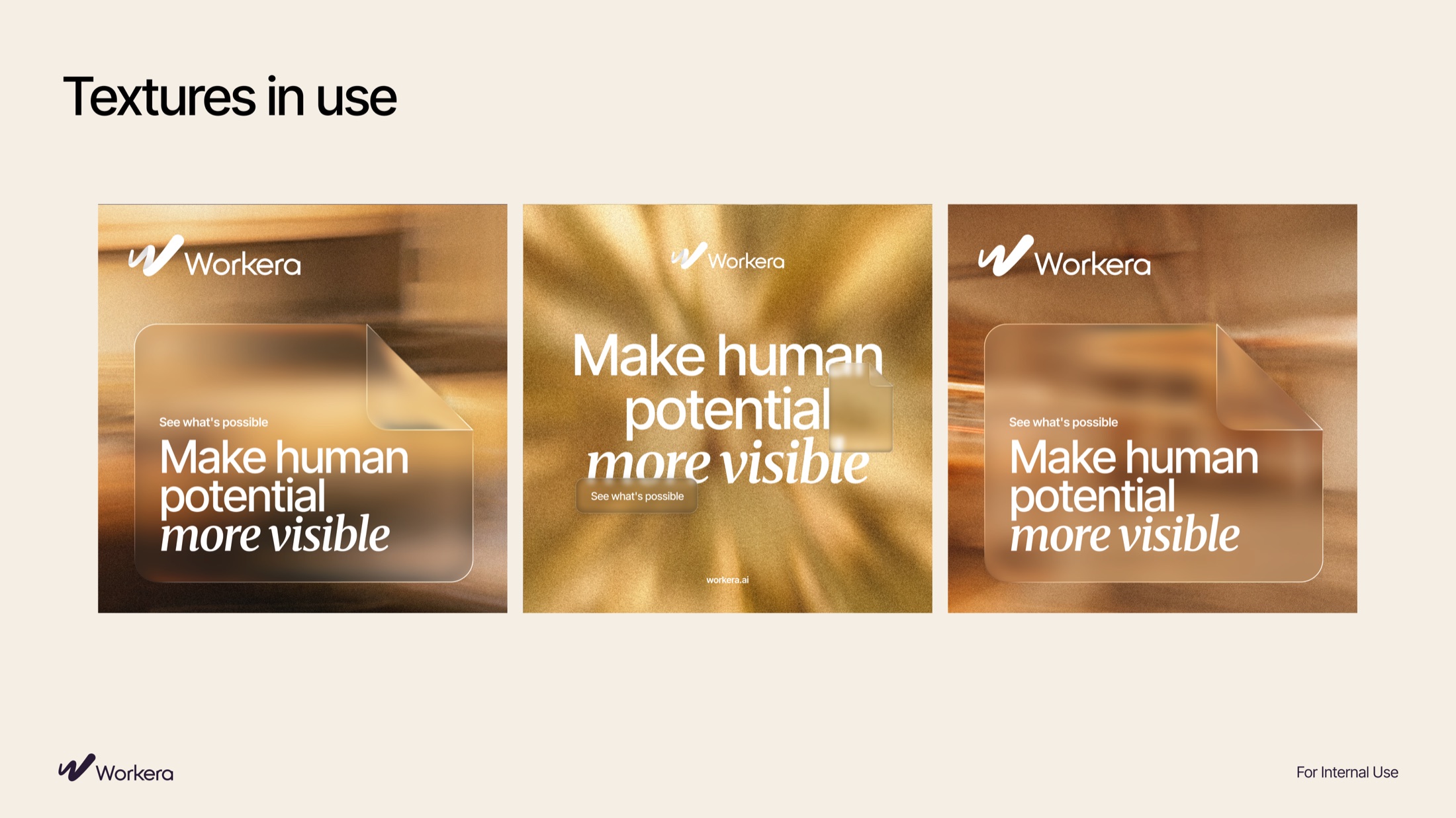
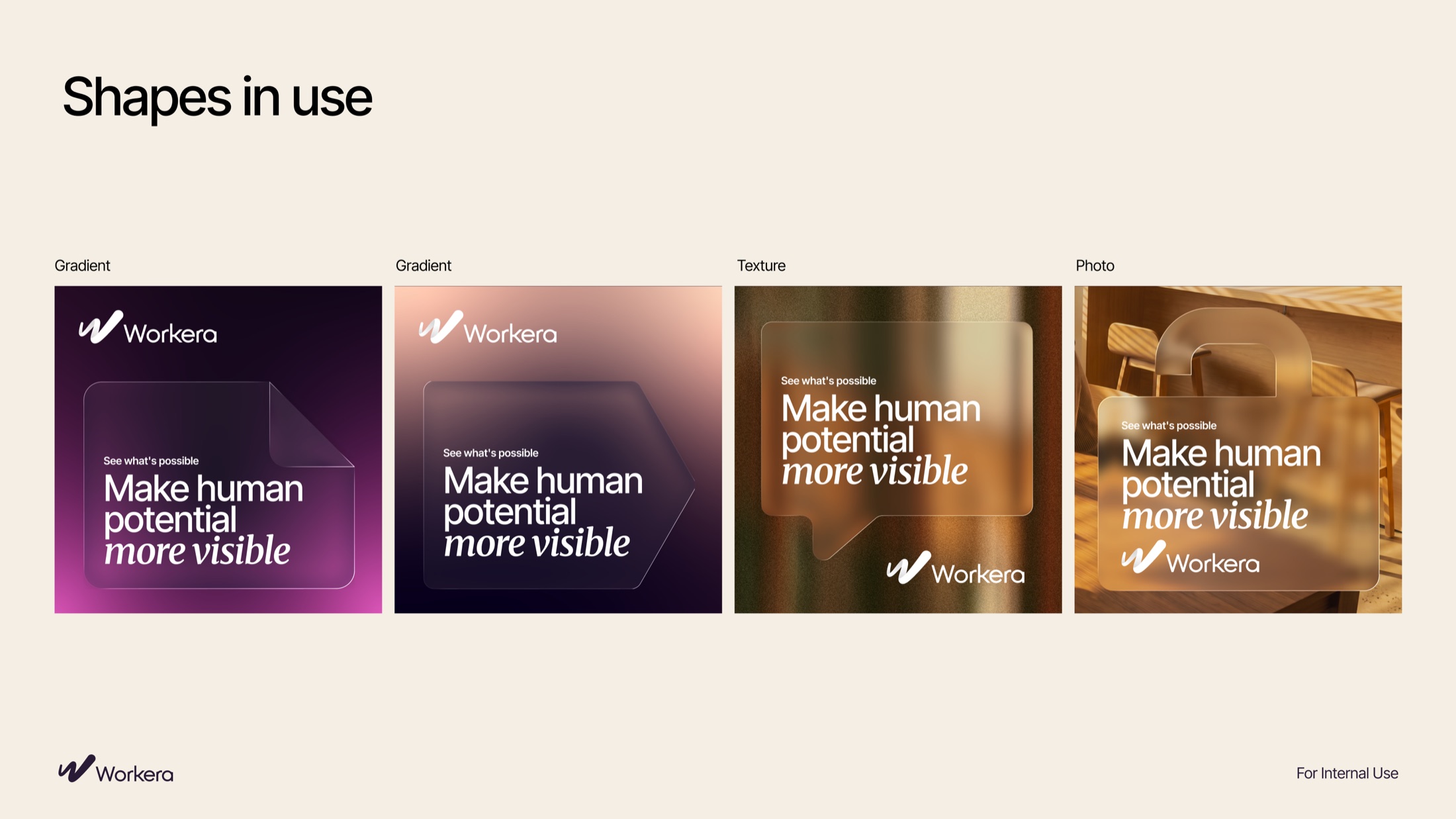
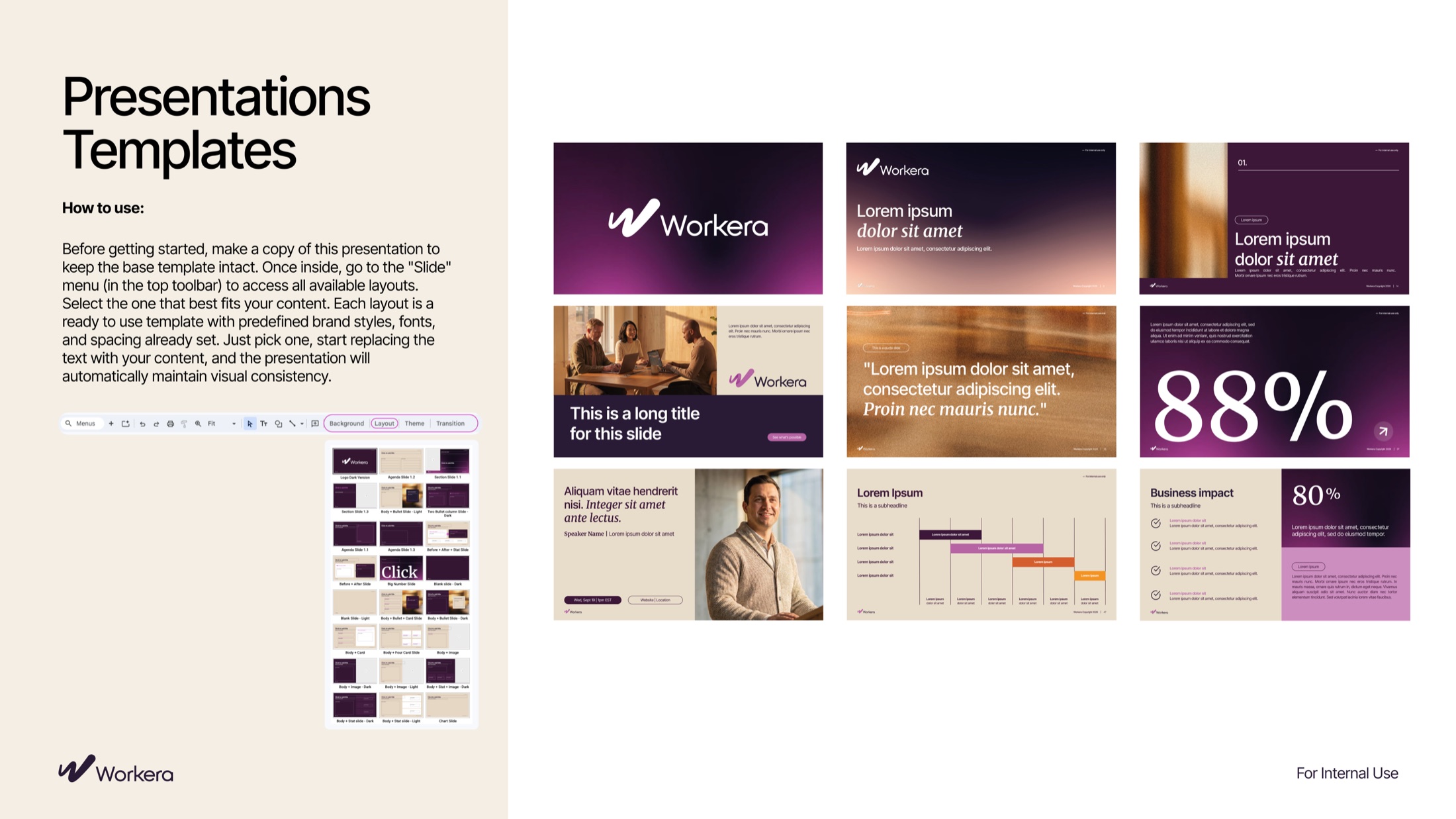
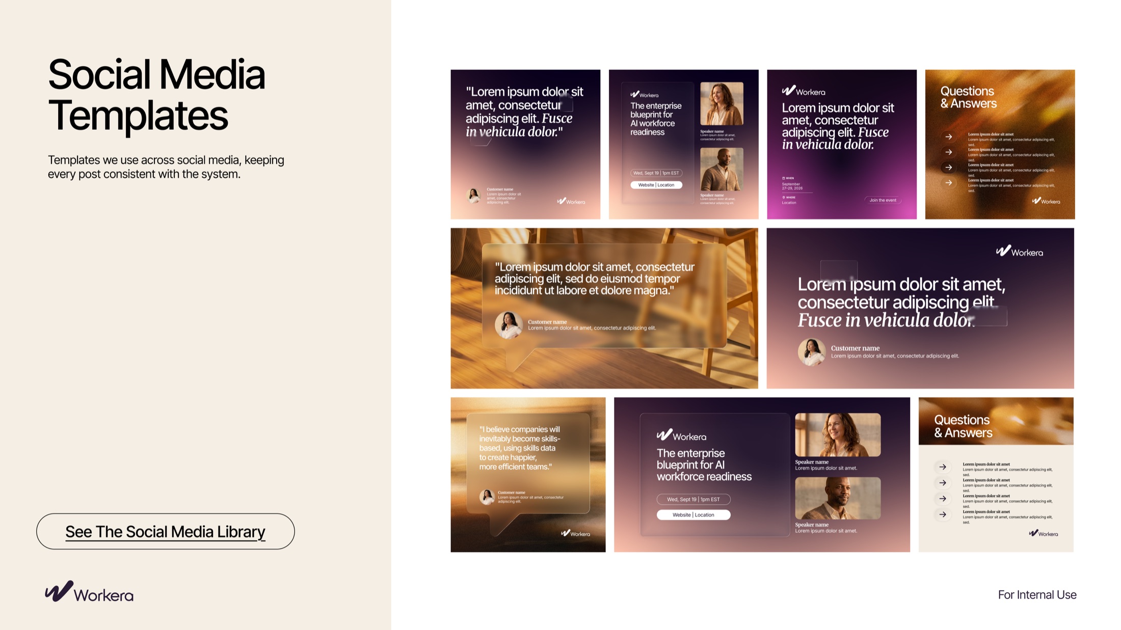
It stayed close to Workera’s existing equity rather than starting from zero, then grew into iconography, gradients, textures, container shapes, and presentation and social templates. A static PDF became a complete, ready-to-use system.
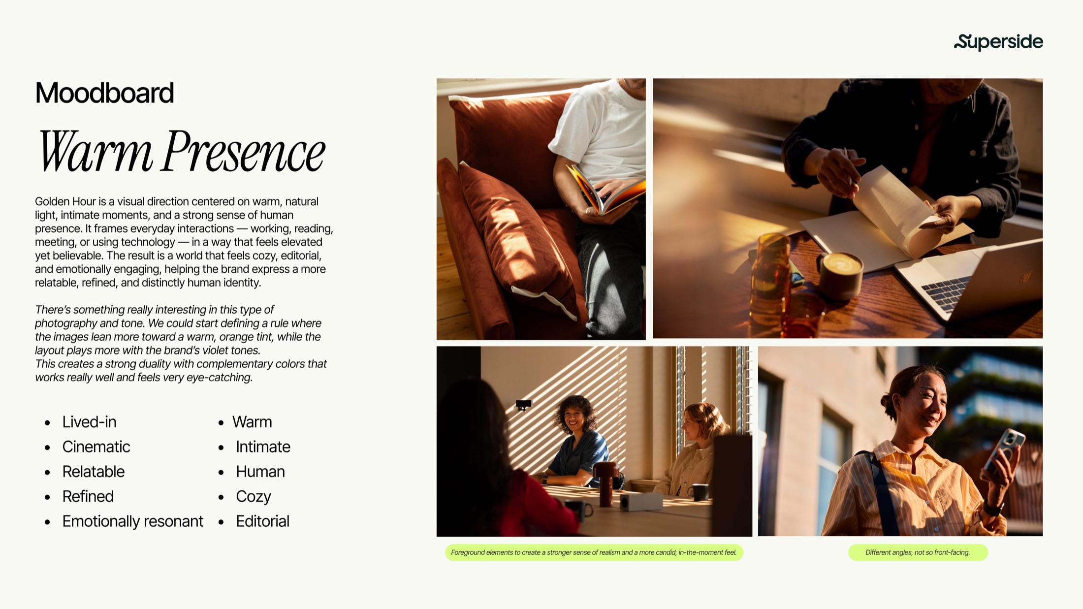
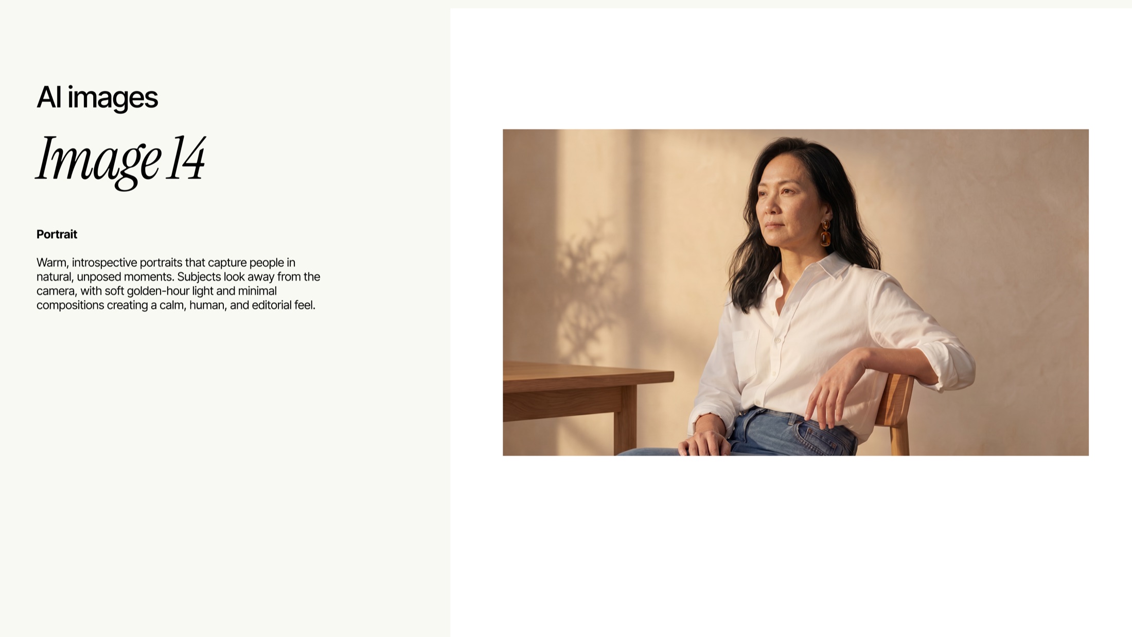
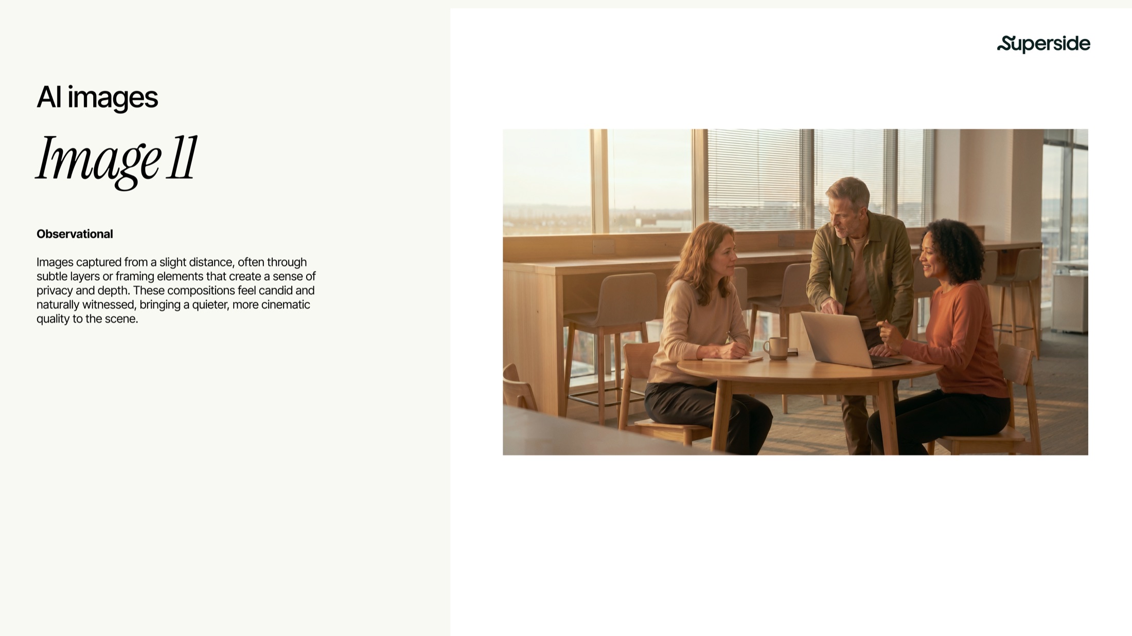
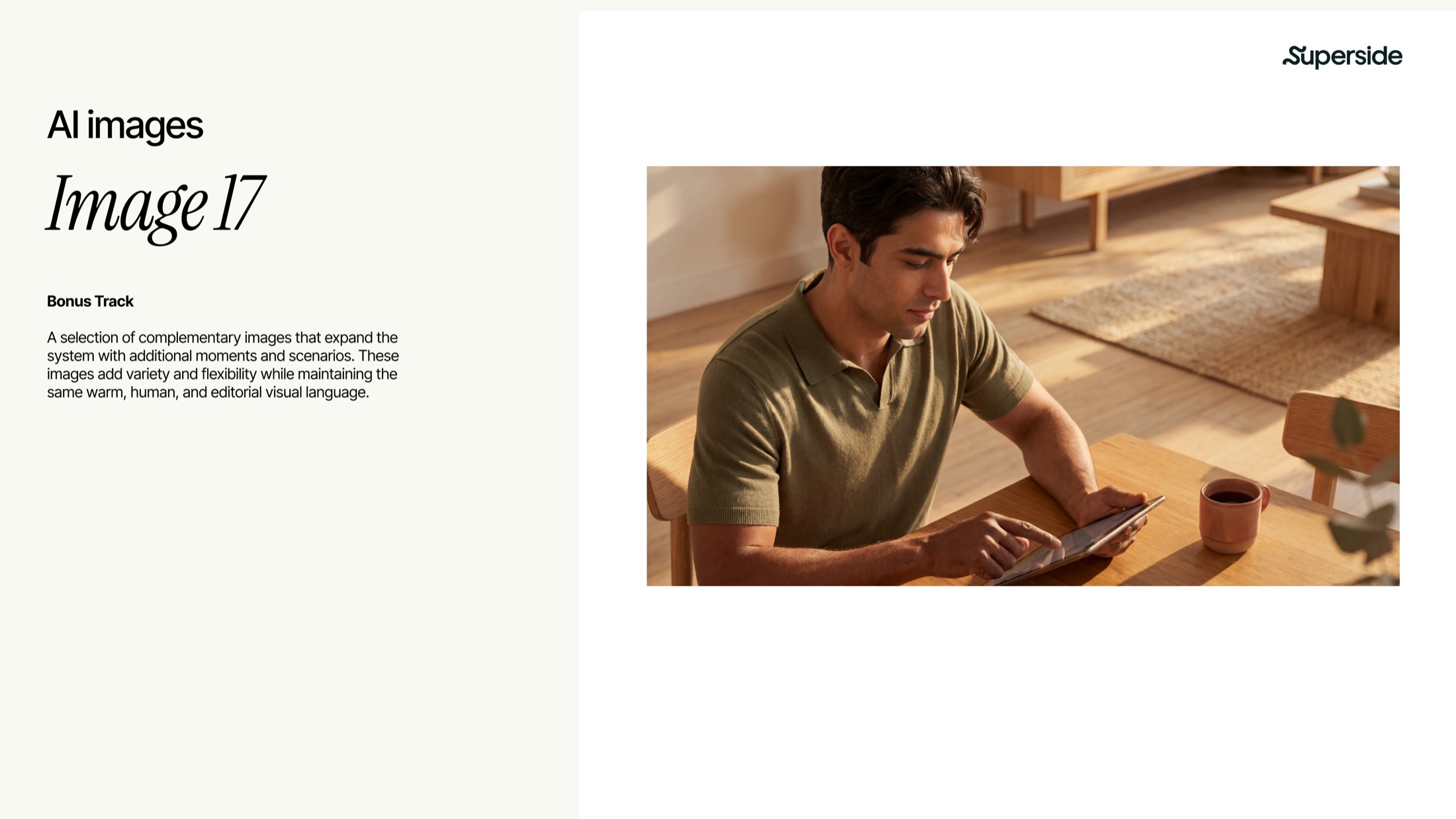
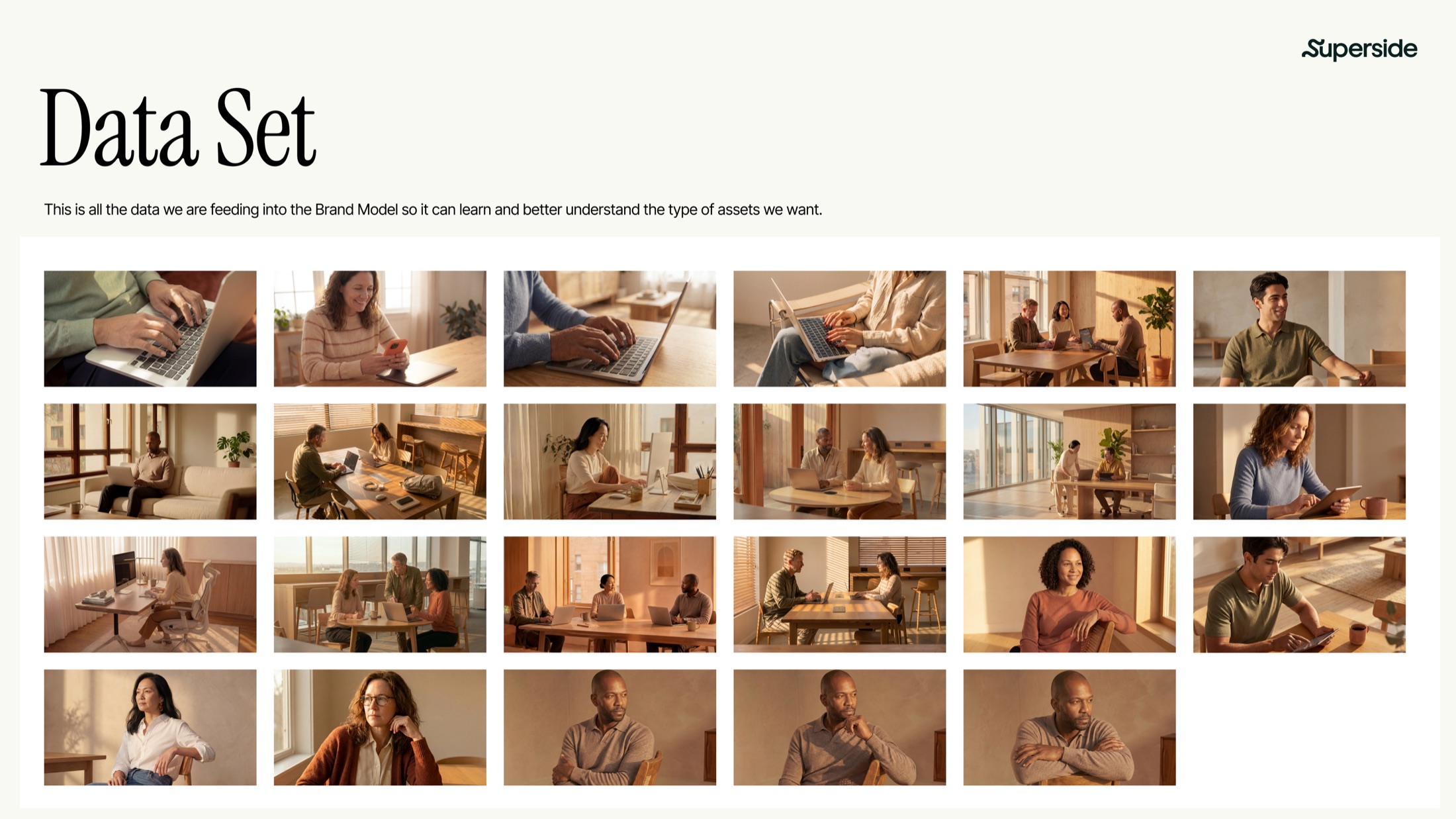
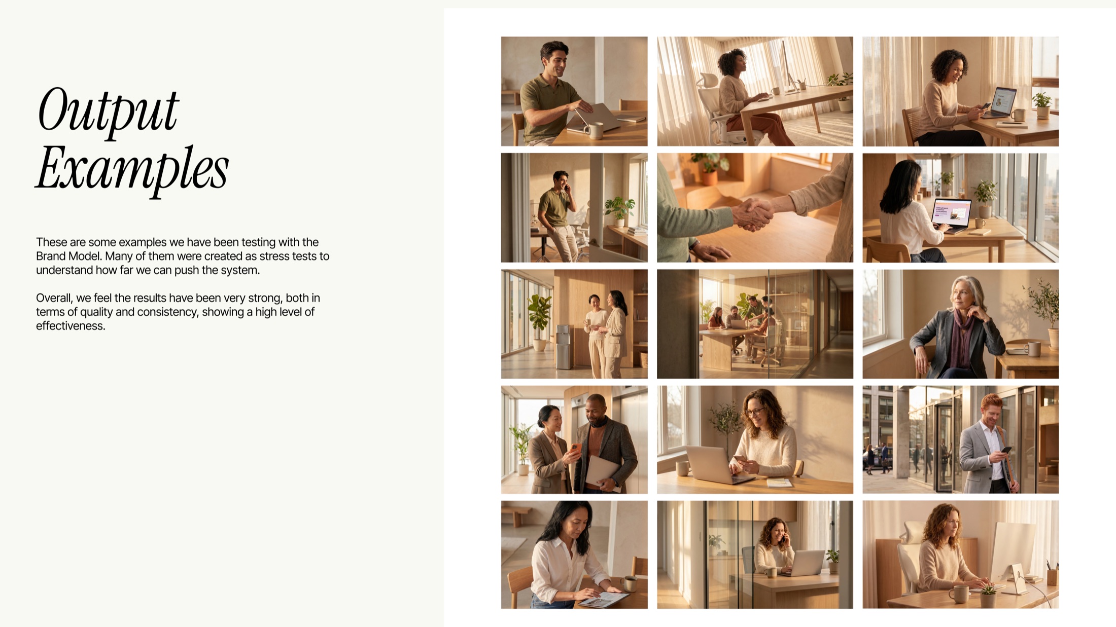
Workera wanted human, editorial photography without a new shoot every time. So I led the creation of its own Brand Model: a custom AI system trained to create on-brand imagery.
Around twenty images defined the look, from lighting and tone to characters and camera angles, alongside a set of “don’ts” marking where it shouldn’t go. A prompt guide taught Workera’s team to run it, and within days they were using it on their own, including for a new product launch.