View
← All work
Magnus Medical · Identity rollout, from reveal film to hardware

A new identity, built to scale from logo to living system.

My roleGroup Creative Director
DisciplinesBrand identity · Guidelines · Motion · Packaging
Years2026
AtSuperside

Magnus Medical adopted a new logo in 2026, and set out to build Magnus as the parent brand over its SAINT treatment for depression. I led the rollout, from a reveal film to the guidelines, the collateral and, eventually, the hardware itself.

Every touchpoint needed to move to the new mark. SAINT needed a lockup that tied it visibly to Magnus. And a new generation of SAINT hardware was about to ship, fully branded as a Magnus system for the first time.

2The system

Magnus first. SAINT by Magnus.

SAINT needed to sit clearly under the Magnus brand, so the team built a “SAINT by Magnus” lockup in horizontal and vertical versions across every colourway.

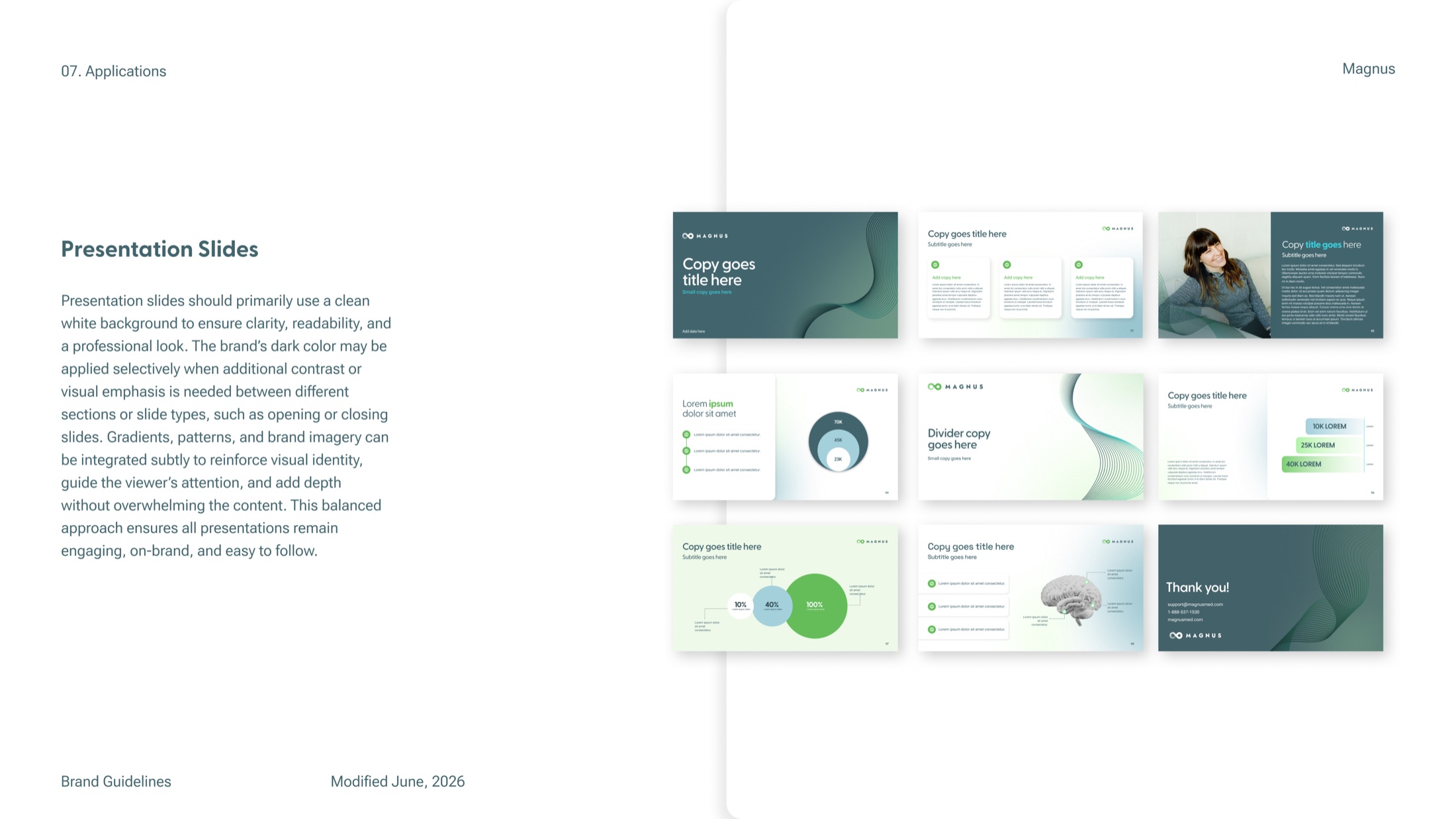
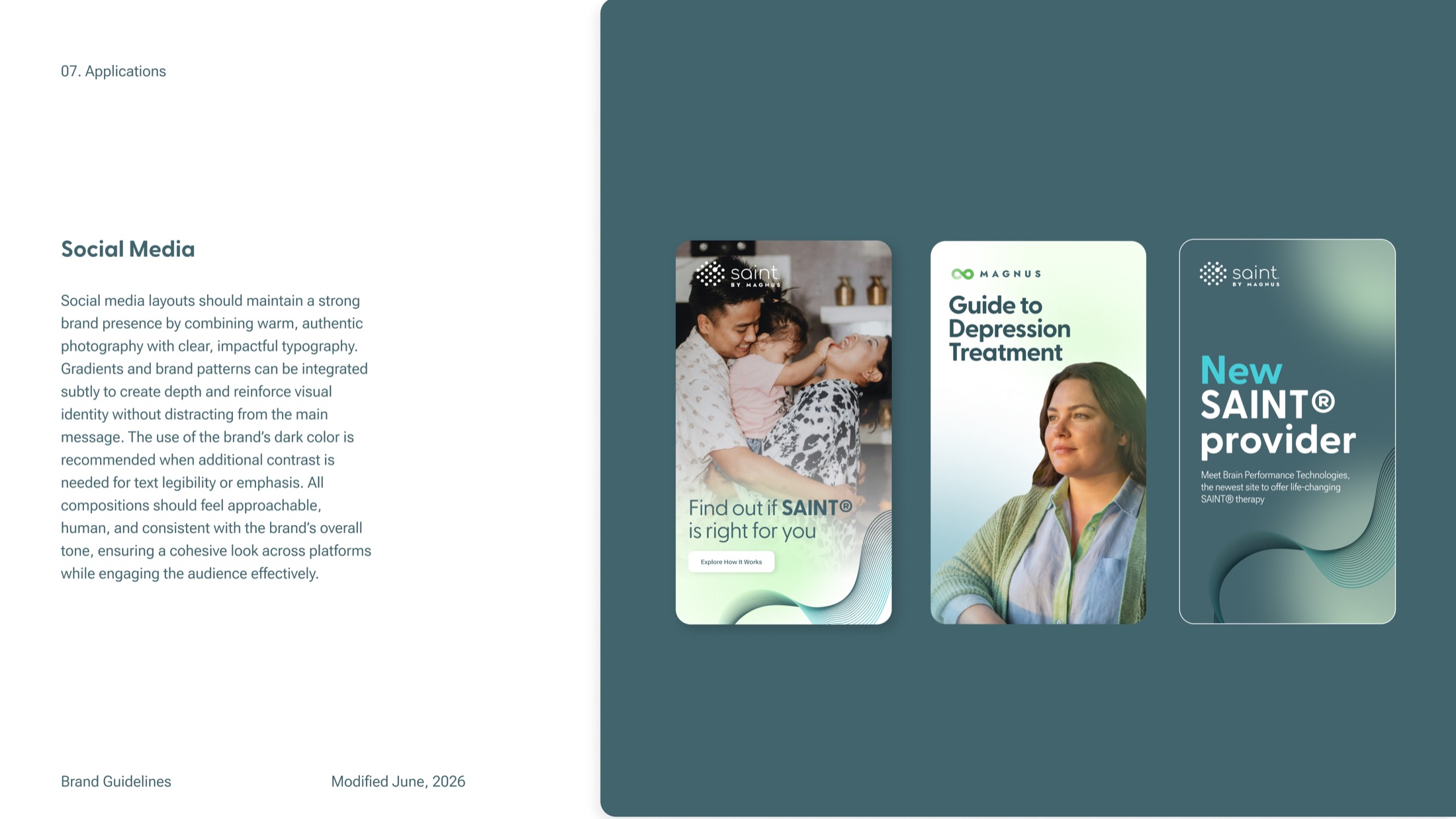
The brand guidelines were rebuilt around it, from mission and logo rules to colour, typography, visual elements, photography and applications. “SAINT Depression Therapy” became “SAINT for Depression” along the way.

SAINT by Magnus lockup, horizontal
SAINT by Magnus lockup on teal
SAINT by Magnus lockup, vertical
SAINT by Magnus vertical lockup on teal
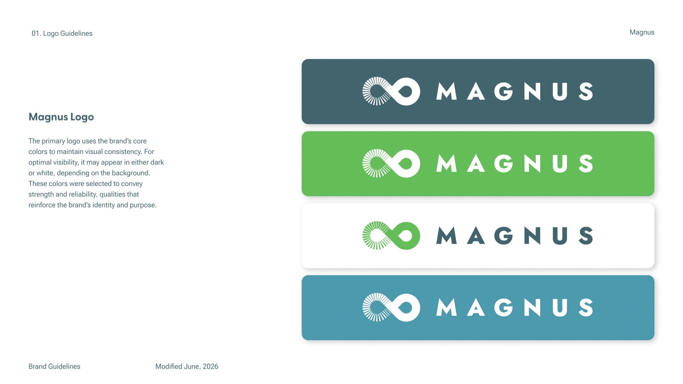
Magnus logo colourways
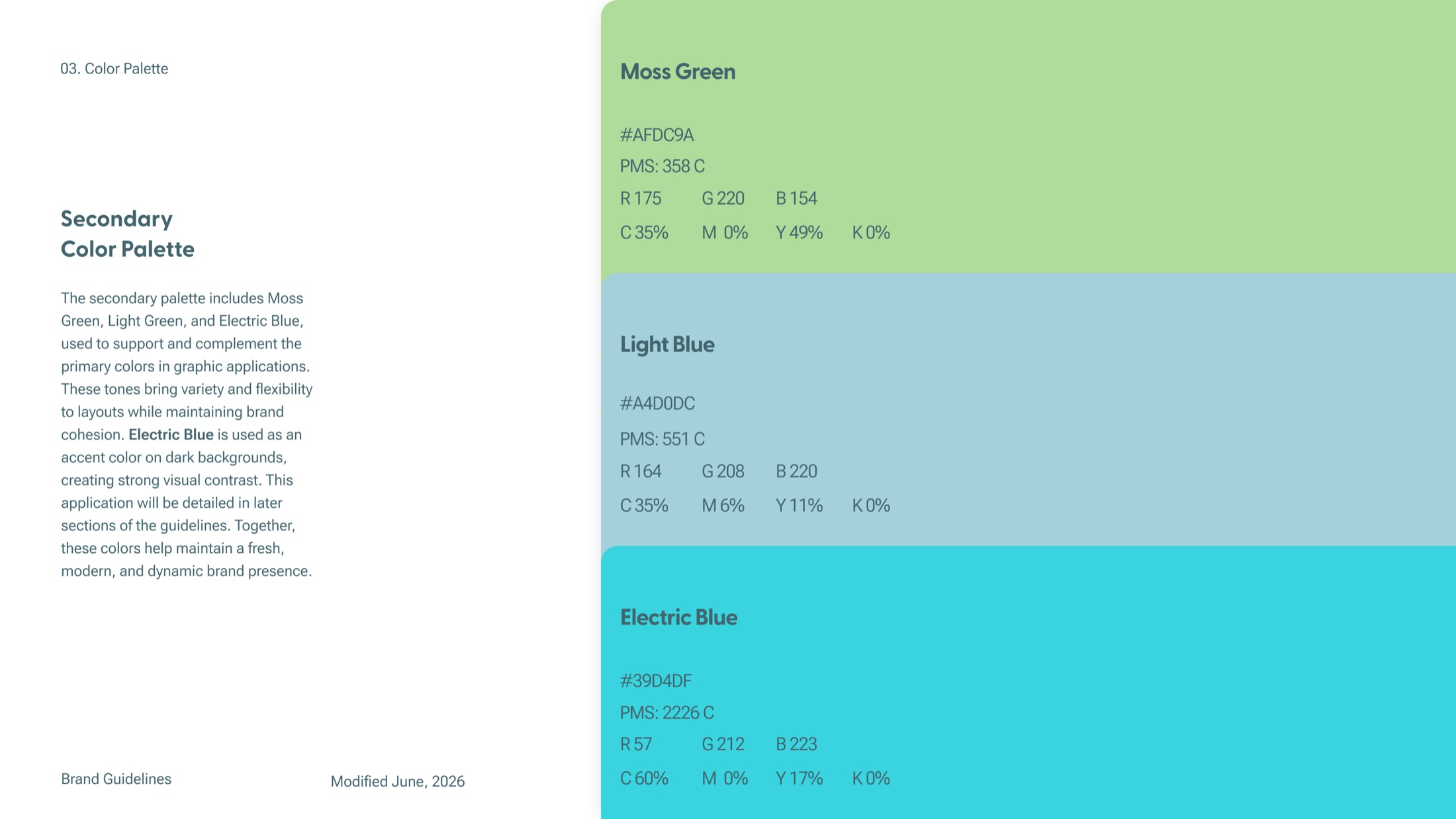
Magnus colour palette
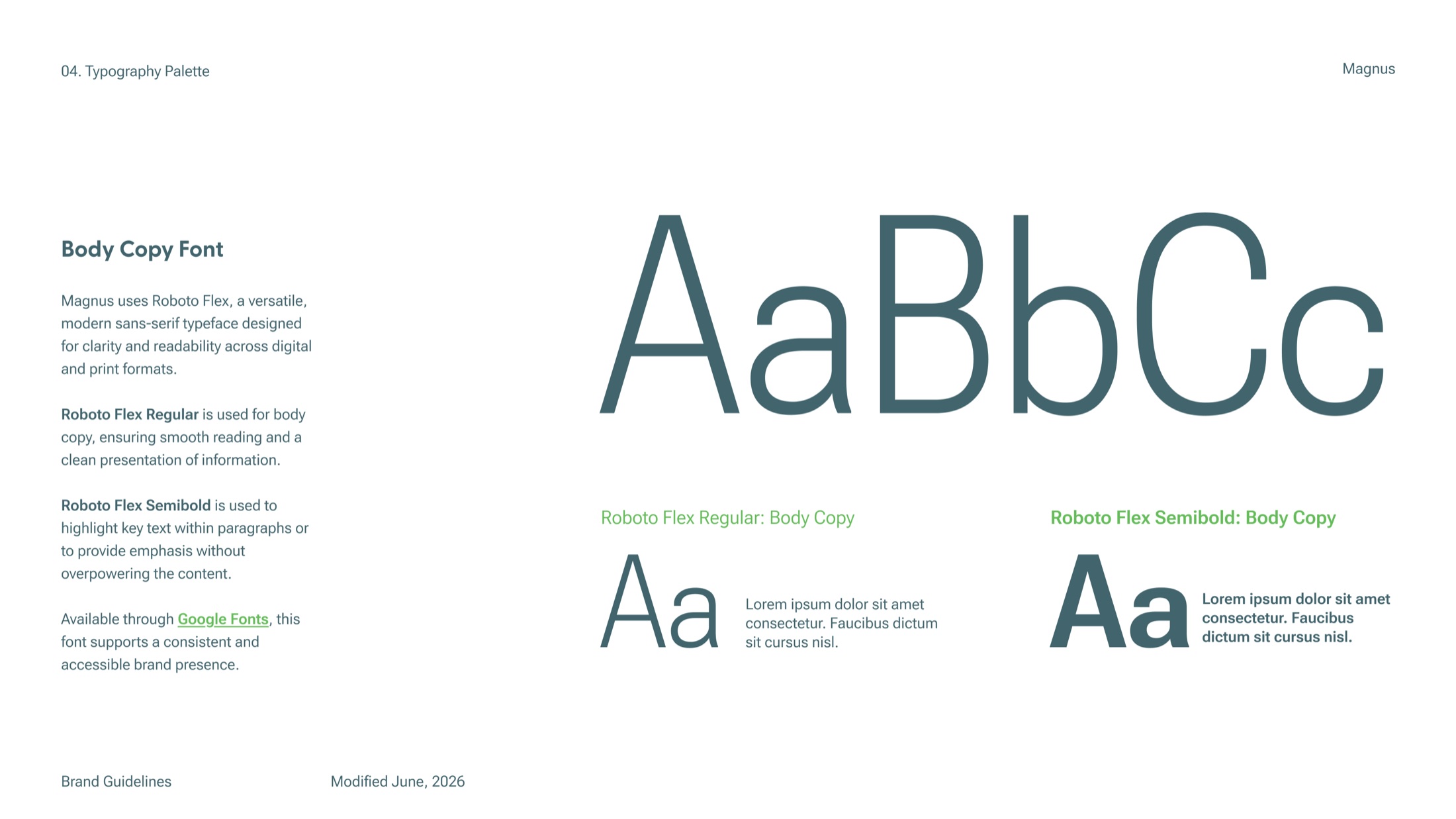
Magnus typography
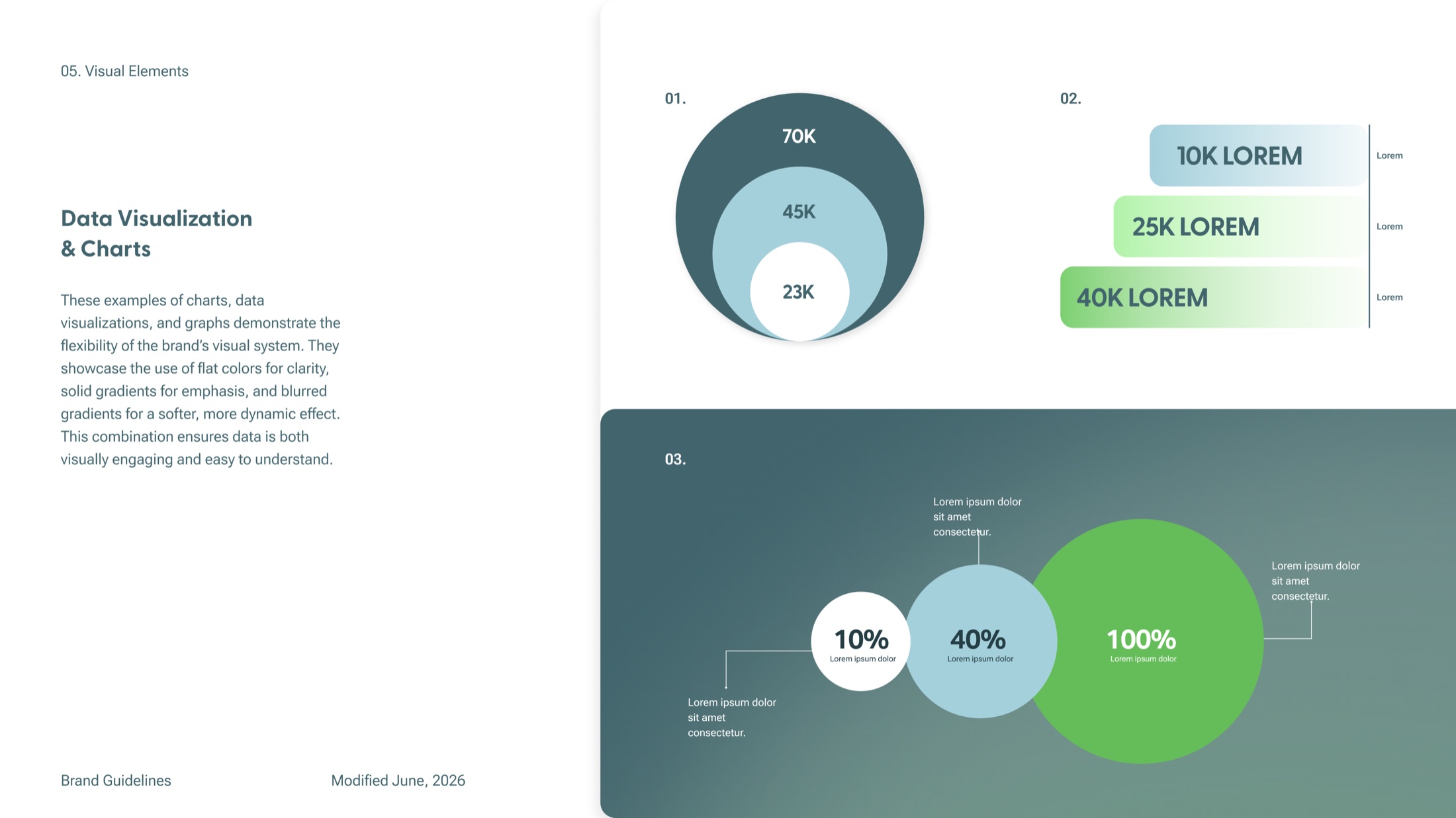
Magnus visual elements
Magnus photography direction
Magnus brand applications